In-Store Central Intranet
The Problem
Sephora, the world’s largest online beauty retailer, hired me to create an intuitive and user-friendly resource for in-store “Cast” employees to easily access content most applicable to their needs.
The in-store intranet is a lifeline for employees where they learn about new products, brands, events, Sephora HQ, details of their employment, and more. The intranet in use had several faults, including: inability to find key information, outdated information with lack of content clarity, information that did not help every different type of employee role, and an unintuitive information hierarchy.
The Goal
A major goal of the site redesign was to flatten the site structure and refine current page types to be more intuitive and consistent across the intranet.
The Process
During the course of six months I created/conducted: stakeholder interviews, key findings documentation, site audit of all content, site map development, page type development, wire frames and a final deliverable with minimal visuals applied.
Wireframes
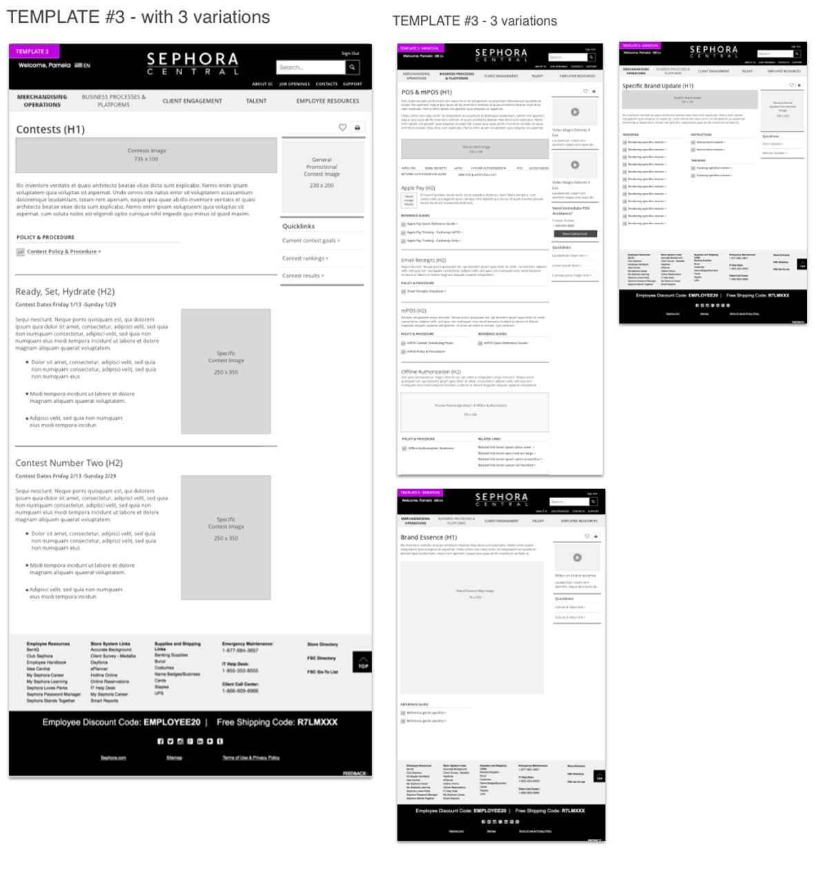
During the design phase we identified 5 different templates. I designed multiple variations of the templates before we decided on a final design.
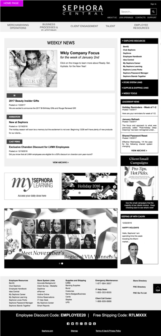
On the home page, the new desktop UI incorporates top areas of interest for Cast employees in the main navigation, time-specific information in the central pane, and employee respurces along the right hand column.
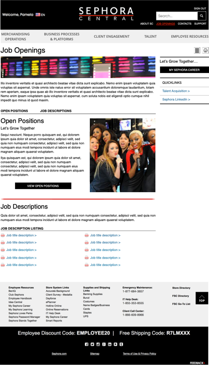
Final wireframe.
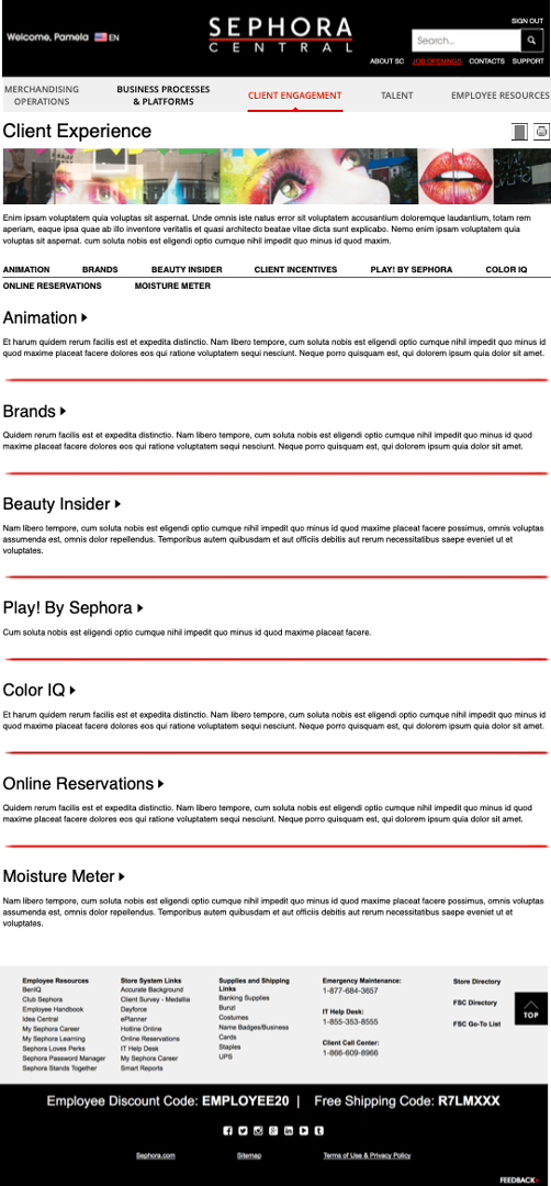
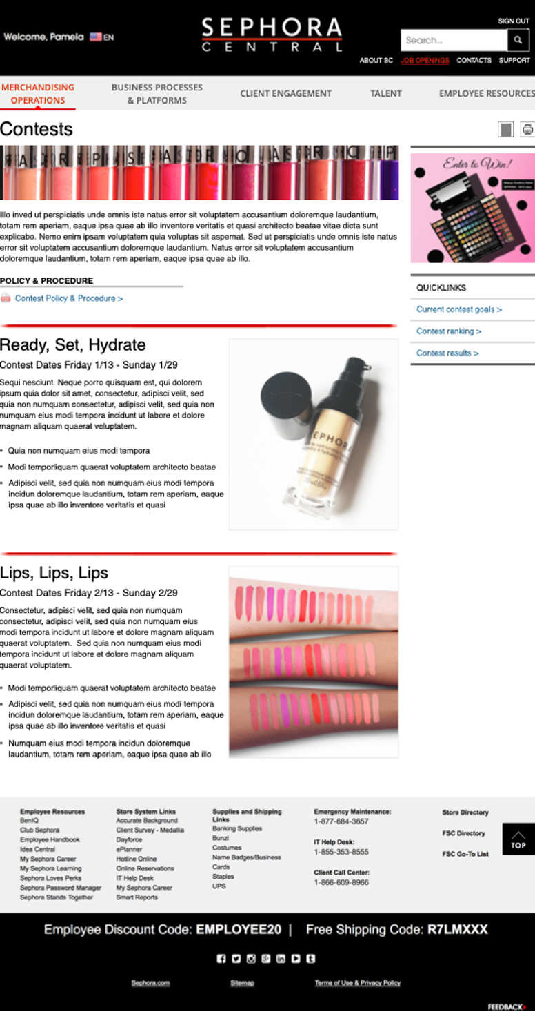
Final wireframe.
